The latest target for our ongoing efforts to improve and streamline the user experience is the Messaging section. We’re making some improvements that will help users find their forms and scenarios faster and easily access the ones they use the most.
Important dates
Before we explain the changes and outline what you can expect to see, there are some dates you should know about:
- The new Messaging section will be available in non-production and early-access environments on Friday, February 5.
- We’ll “toggle it on” across all production instances on Tuesday, February 23.
We’ve built a little extra time into the deployment timeline of this feature (and the Krull release) so that customers have a chance to really get familiar with the new interface and learn how to make the most of it.
Let’s get started!
The first thing you’ll notice is that when you click the Messaging option in the navigation menu, instead of seeing a pop-out menu of available messaging forms, you go straight to the new Messaging page:
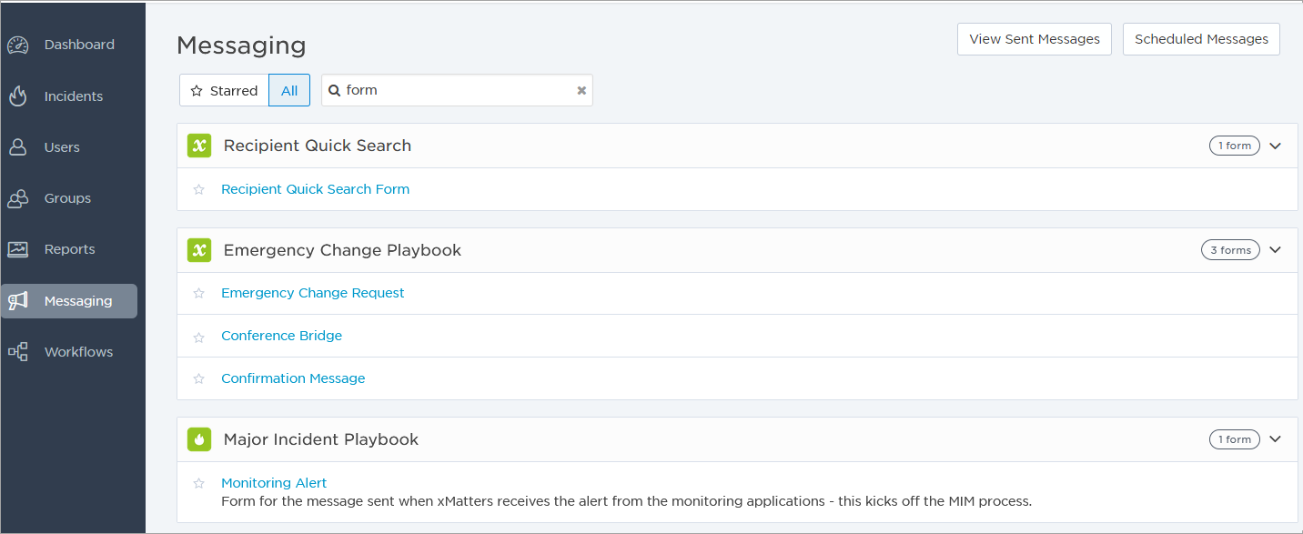
We’ve redesigned the Messaging section to use the same enhancements we implemented on the Users and Groups pages, and to display forms and scenarios in an expanded list. (If you're wondering where the View Sent Messages and Scheduled Messages options went, they're right there at the top of the page for easy access.)
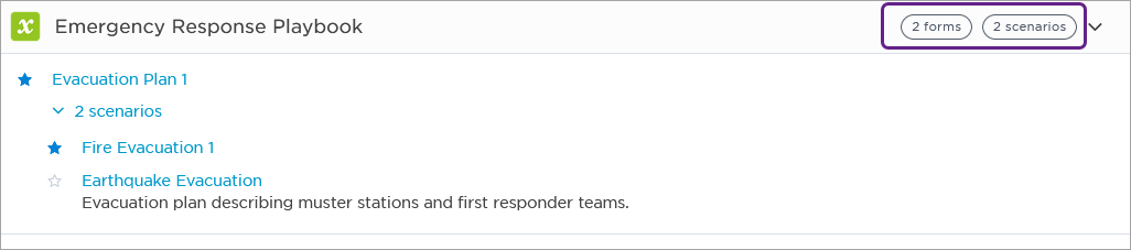
The layout of the new Messaging page is representative of what you may be used to seeing on the navigation menu. Each workflow is expanded to show its forms and scenarios, and you can quickly see how many are are in each workflow with an info pill on the right side of the screen. Click the arrow beside the pill to expand or collapse an individual workflow.
By the way, this is a great time to make sure your workflow, form, and scenario names are unique and that they all have helpful descriptions. This makes both forms and scenarios easier for other users to find quickly.
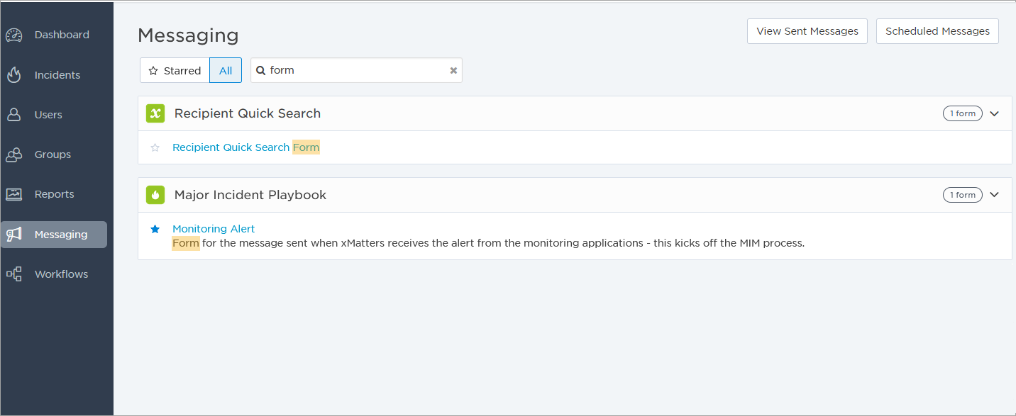
Speaking of finding things, to quickly locate a specific form or scenario, type something in the Search field to search by name and description. Whether you’re using full names or just a partial word search, the results highlight where your search term appears.
If you have a number of forms or scenarios that you use more than others, we’ve got you covered too. Click the star beside the name of the items you use most often.
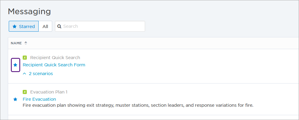
Once you’ve marked your most commonly-used items, you can hide everything else to make it even easier to find the one you need. To show only the starred items, click the Starred button at the top of the page:
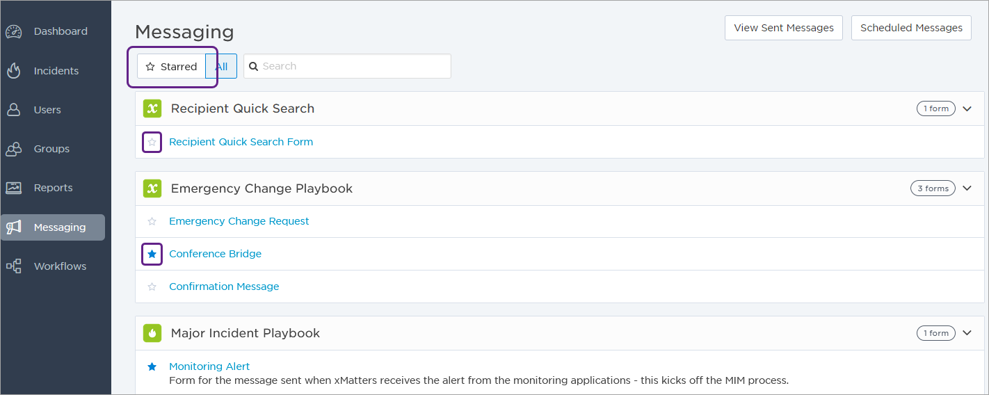
And, finally, to compose a message or initiate a scenario, simply click its name in the list to open it and see the rest of the options.
We think these changes will really help to streamline the process of sending messages by giving you more options to organize your forms and scenarios, making it easier to find the ones you want, and improving the overall interaction.
Oh, before we forget! Look for similar enhancements coming soon to the xMatters mobile apps for Android and iOS.
Comments
0 commentsPlease sign in to leave a comment.